Designing the logo for Inspired Executives was an important cornerstone in starting her Executive coaching business. The following story provides personal insights to this highly creative process.
Kerstin Jeckel and Karl-Martin Hartmann are artists who do not create logos every day – and not for everyone! If they decide to work with you, you will experience their dedication and ability to completely understand your business. Kerstin and Karl-Martin really get to know those whose corporate design they develop. They fully support their clients’ business and ideas. The ideal logo represents the business concept, its strategy and success in a sustainable way: It is a big challenge and responsibility.
Kerstin and Karl-Martin and Annette Czernik have been good and longstanding friends. Annette loves their art, creativity, originality and professionalism. Kerstin and Karl-Martin are quality-driven; they only stop when their inner critic is satisfied. Annette graduated from her international coach training school at the end of 2010, and is now building an Executive Coaching practice.
Imagine a beautiful summer day; the three friends have lunch at Crass Castle close to Rhine River. We talk about the name of the coaching company that needs to be globally understood and the logo that reflects the name visually. First ideas. First sketches. Rejections. The first name idea is followed by many more, ideas of visuals turn into symbols.
After her last training module in Chicago, Annette announces the name of her company: Inspired Executives. A little later, this is followed by the publication of the company’s claim: Masterful Coaching for Leaders, Professionals and Creative People. Great starting point.
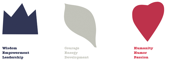
The initial sketches of the logo are useful as the content hasn’t changed but thoughts have become clearer. The outcome of intense discussions between Karl-Martin and Annette is that three organic forms should represent Inspired Executives in the market. Butterfly and flowers seem inappropriate for that purpose. Karl-Martin puts the organic forms of Inspired Executives on paper: crown, leaf, heart. The content of the forms need to be in alignment with the identity and goals of Inspired Executives. The crown stands for wisdom, empowerment and leadership; the leaf symbolizes courage, energy and development, and the heart represents humanity, humor and passion. Our enthusiasm increases.
The logo needs some color, of course. Kerstin: “Color is my area of expertise, I am best at it, and it’s me.” Karl-Martin: ”Sure, and I see different colors than you do.” Annette: ”Your colors are wonderful – the only question is whether or not my potential clients understand them.” We want to continue to create a naturalness of color, form and name. The artists think, ponder, draw, draft, reject, see, scroll, feel, talk, paint, read, sketch, discuss, argue, play.
Now it is golden October. Annette visits Kerstin and Karl-Martin in their artist workshop at Wiesbaden / Germany. We get closer and closer to the final version of the logo and are determined to achieve it today. Each artist sits in front of his / her computer. Annette watches and observes, and is often asked to provide her input and opinion. Every now and then printouts are put on the large table for all of us to take a look at them. The leaf needs a softer line and the heart more verve.
Karl-Martin works on the forms, Kerstin focuses on the colors. “Annette, come on over; we’ll do the logo in pink, green and orange.” Annette closes her eyes – “please don’t!” Kerstin: “But it looks fantastic!” Annette: “I do not know anyone who would hire a pink-green coach.” She is right. And Kerstin continues experimenting in her special chart of color range. We are busy the whole day: talking, thinking, eating, drinking, testing, creating color samples, discussing interim results.
Annette has had basic ideas about muted coloring of the logo for a while long before the crown, leaf and heart have yet been in existence. Kerstin is skeptical if the muted colors are the right choice; Karl-Martin is more open and drops the turquoise. Annette begins to learn patience and relaxation, connects the different viewpoints and is determined to discover the appropriate colors.
We study color guides. Potential colors are reduced to blue, red and grey. The temperature of the color needs to be chosen. We test shades on two different screens, print them out, review them – have red wine, sushi, coffee and tea; light on and off – we want the optimal result and we will get it. We are excited; tension is in the room. Take a little yellow off the grey, add more blue to the red, the blue is too light, we need to give it more depth. That’s what we do for an hour or two.
And then, eventually – satisfied, happy and exhausted; the Inspired Executives logo proudly presents itself. It is now late evening. The finishing was tiring for three people for many, many hours. Now we need to take a look at it with fresh pairs of eyes, tomorrow and next week.
The following days, we exchange e-mails: “Do you still like the logo today?” “I am thrilled. I do not need to think about it, it is perfect.” Next day: “The logo is great, isn’t it?” “It’s perfect! I feel really good when I look at it.” “Do you want to think about it again?” “No.” And Karl-Martin from the depth of his study: “You girls, it is right, it is good – stop worrying about it”. We are happy. It is the world’s best logo for Annette’s Inspired Executives coaching business.
We have learned from and with each other from the summer through to the fall. We closely collaborated, we inspired each other, we were able to implement cool ideas, and we deepened our friendship. What luck, what a gain! And: we have the logo!
We have discovered and used the ingredients for productive collaboration: passion, openness for any experience, detachment from the result, humor, non-judgment and deep listening.
By Kerstin Jeckel and Annette Czernik
